Makeup
Blush placement, by face shape and finish
Why the same blush color reads differently by where it lands — a placement map read from the way brands publish their own shade charts, not from a trend cycle.
Blush placement advice tends to arrive as a diagram of circles and lines: apples of the cheeks, cheekbone sweep, the “draping” contour.
What the diagrams rarely explain is that placement and finish are the same decision — a cream blush set high on the cheekbone does something visibly different from the same pigment packed on the apples, and the brands that publish shade charts know it.
How brands group their shade charts
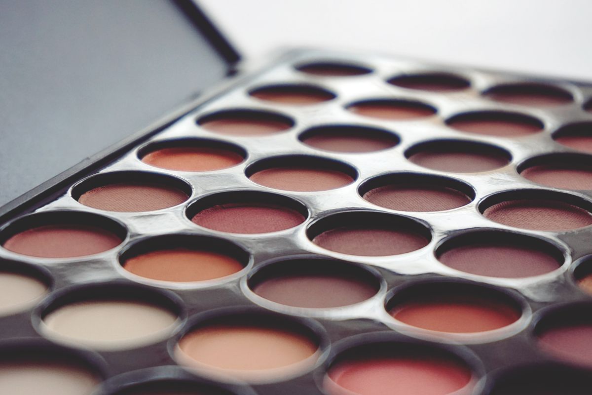
Look at how powder and cream brands structure their shade charts and a pattern emerges: shades are grouped by depth and undertone, not by placement. The placement is left to the applicant because it is the one variable the brand cannot see. That is also why the same shade can read “natural flush” on one face and “stage makeup” on another — the pigment is identical; the geography decides.
Depth determines how far from the face’s center a color can sit without hardening the look. Deep berry tones placed forward on the apples read theatrical on fair skin; the same tone set back along the cheekbone, toward the hairline, reads like evening depth on deeper skin. Pale pink does the opposite: close to the center of the face it reads youthful, pushed out to the temples it can vanish entirely on deeper skin.
The two placements that cover most needs
Set-back placement starts above the ear’s top attachment and blends forward along the cheekbone, stopping before the pupil line — the positioning that mimics where a flush actually arrives after exertion.
On cream and liquid finishes it reads as “healthy” rather than “made up,” which is why nearly every no-makeup-makeup tutorial lands there regardless of face shape.
Forward placement — on the apples, blended slightly up — is the positioning that reads as deliberate makeup. It shortens a long face visually and warms a square one, which is why round-blush techniques aimed at square and oblong faces end up there. On powders, forward placement holds its shape all day; creams placed this far forward need a set or they migrate.
Finish decides, more than shape does
The honest summary of the face-shape guides: they matter less than finish. A round face with a cream blush placed back on the cheekbone looks more sculpted than a round face with any powder anywhere, because the cream’s sheen does the contouring that the diagram tries to do with pigment position. Conversely, a long face benefits from forward powder placement precisely because powder does not lift the face the way a dewy finish can.
A practical rule that survives contact with all the diagrams: pick the finish for your skin type (cream for dry and mature, powder for oily), then place creams back and high for the “from within” read, and powders forward for the “blush as makeup” read. Every shade on the chart works with both placements — the chart groups by tone, and the geography is yours.
The shades, side by side
Swatch positions approximate the brand's own shade chart; screens shift color.
Frequently asked
- Should blush go on the apples or the cheekbones?
- Both, for different reads. Apples with powder reads as deliberate makeup and shortens longer faces; cheekbone placement with cream reads as a natural flush. Pick by the look you want and your skin type, not by a universal rule.
- Cream or powder blush — which lasts longer?
- Powder holds its placed shape longest, especially on oily skin. Creams read more natural and lift dry or mature skin, but placed far forward they need setting or they migrate. Skin type should choose the finish more often than the trend cycle does.
- How do I pick a blush shade for my skin tone?
- Follow the depth and undertone grouping brands use on their own shade charts: fair and cool skins in pale pinks, medium neutrals in soft rose, deep and warm skins in terracotta through berry. A shade one step deeper than your natural flush is the usual starting point.