Makeup
Eyeshadow color theory: complementary shades and the three-depth rule
How complementary shades calm red lids, how the base-transition-deepen structure works, and why saturated trend colors need graying before they flatter on eyes.
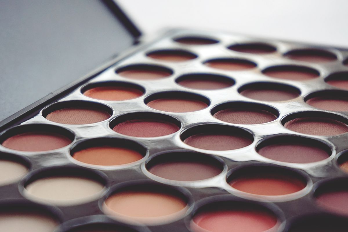
A palette is sold by color, but an eye reads value and temperature first. That gap explains most disappointments: a shade that glows in the pan turns muddy on the lid, a trend color reads theatrical, and the fix is never buying another palette. It is a short list of rules about which colors cancel which, what depth does, and what shimmer is for.
Complementary color does the correcting
Across a color wheel, red’s opposite is green, and that relationship is the whole logic of lid correction. Eyelids that read red or violet — from thin skin or plain genetics — calm down under olive, warm brown, and taupe, all of which carry a muted green-brown cast. The same logic runs in reverse: pink-toned and plum shades amplify red lids, which is a feature or a bug depending on the goal.
The caution is muddiness. Complementary pigments neutralize only until the two meet in the wrong proportion, at which point the blend turns gray-brown dirt. Muted, brown-shifted shades stay on the safe side of that line; saturated pure tones cross it easily.
Three depths, three jobs
Nearly every wearable eye look is a value structure, not a color choice. The base shade — the one closest to the lid’s own tone — covers the mobile lid and sets the canvas. The transition shade, one step deeper, sits above the crease and above the base, and its only job is to kill hard edges; it is what makes a look read as blended. The deepening shade goes in the smallest area: the outer corner, the lash line, the crease shadow.
Depth does the work, hue decorates it. Two looks built from the same three-depth structure read as siblings even when the hues have nothing in common, which is why a neutral palette and a colorful one produce the same faces at different volumes.
Matte builds the shape; shimmer reports it
The division of labor is consistent across price points. Matte pigment holds shape and kills edges, so it builds the structure: transitions, deepening, any deliberate geometry. Shimmer and satin finishes catch light, so their job is emphasis — the center of the mobile lid, the inner corner, nowhere structural. Shimmer in a transition zone reads as a smudge by afternoon.
Placement has to survive eye shape. On hooded or deeply creased lids, the mobile lid disappears when the eyes open, so shimmer parked on it vanishes with it; the highlight moves up to the crease or the brow bone where it stays visible. Wear time is its own problem, solved before any of this starts.
Why trend colors need graying
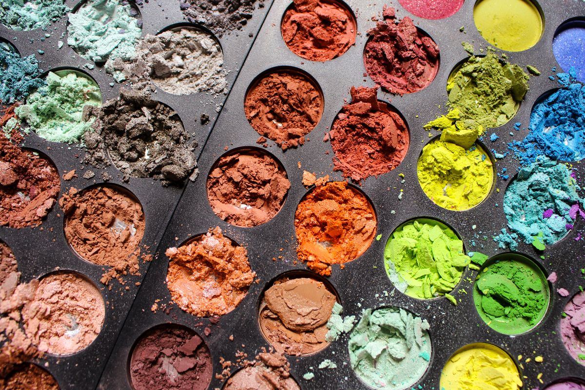
The colors that sell palettes — saturated coral, electric blue, bright violet — rarely survive intact on eyelid skin. The lid is thin, slightly red, and produces oil; pure saturated pigment over that base goes louder and muddier at once. The shades that actually flatter are the same hues with gray or brown mixed in: the dusty, muted versions that look dull in the pan.
That dullness is the point. A grayed coral keeps the warmth, loses the neon, and reads as skin that happens to be warm. The full-saturation version works, but as liner or a one-eye accent, not as a wash. Blush placement follows the same logic — muted over bright for anything applied across a large area.
None of this requires more than one palette. Pick a muted version of any color you like, build the three depths, put the light where the eyes open — and the trend cycle becomes optional.
Frequently asked
- What eyeshadow colors neutralize red eyelids?
- Shades with a muted green-brown cast: olive, warm brown, taupe. They sit across the color wheel from red and cancel it. Pink and plum tones do the opposite and amplify red lids. Keep the correcting shades muted — saturated pigment over red skin turns muddy.
- How many eyeshadow shades do you need for one look?
- Three, doing three jobs: a base close to your lid tone, a transition shade one step deeper to kill hard edges, and a deepening shade for the outer corner and lash line. The depth structure carries the look; the specific hues only decorate it.
- Why does eyeshadow look different on the eye than in the pan?
- The lid is thin, slightly red, and oily, so pure saturated pigment reads louder and muddier than it does in the pan. The muted, gray-shifted shades that look dull in the palette are the ones that flatter on skin. Pan appearance is packaging; lid appearance is chemistry.